horizon dine
instructor: Katey Strafford
institution: Tyler School of Art & Architecture
Horizon Dine is a restaurant brand I created where you can escape, be captivated by nature and have a once in a lifetime dining experience. Located in the mountainous Poconos, this unobstructed view showcases some of the best sunrises and sunsets in the world. Our clear glass walls give you a front row seat to take in all of nature’s beauty while you eat. We are open during both sunrise and sunset hours with menus that cater to each experience. Our goal is to offer an unforgettable meal with lifelong memories.
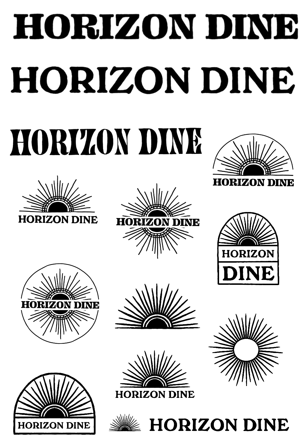
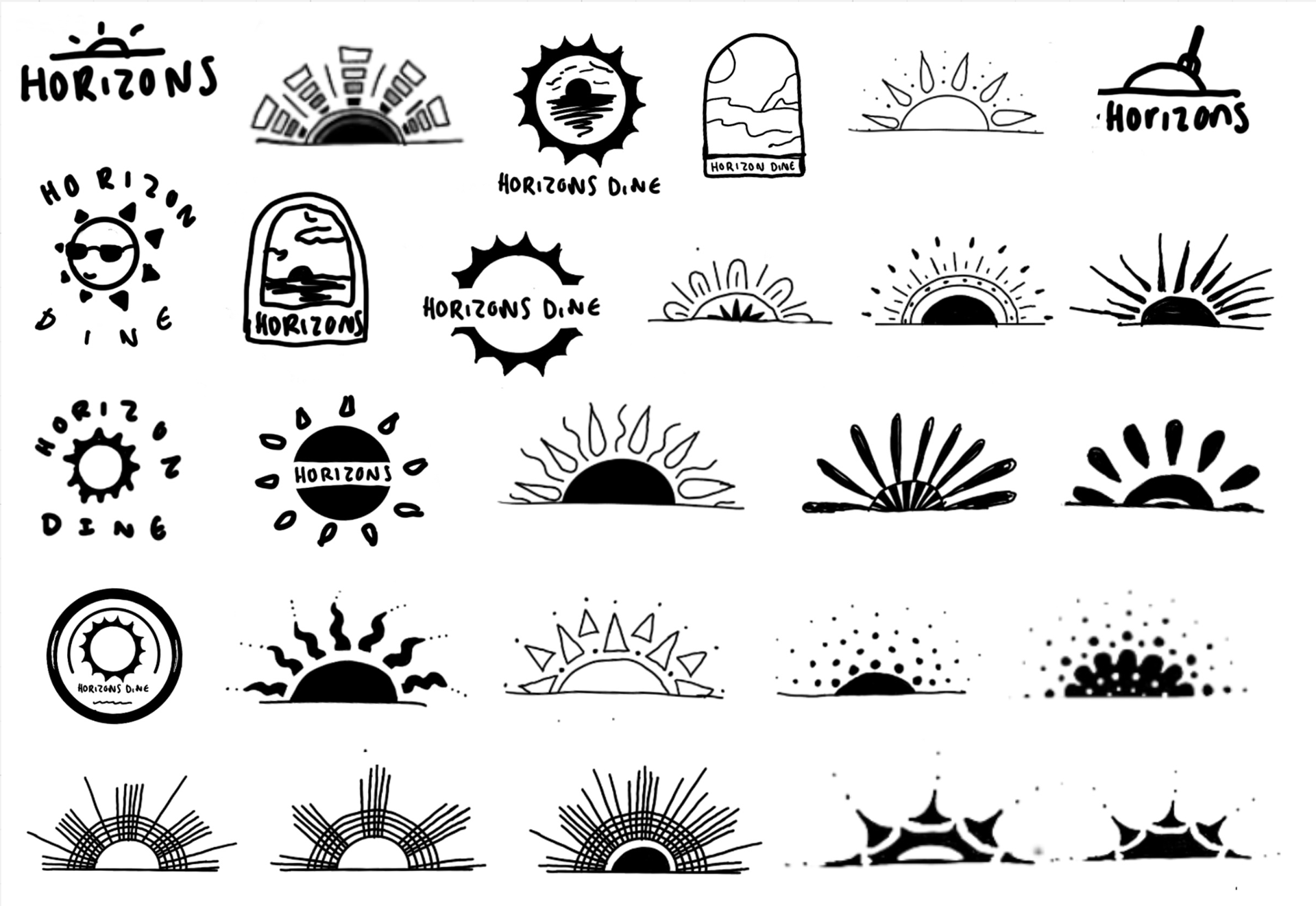
Logo sketches
For my logo I wanted a hand drawn approach because, like nature, theres beauty in the organic and imperfect. I wanted it to feel warm and intriguing. A sneak peak of whats to come if you visit. I chose to illustrate the sun rising and setting to represent the restaurant's concept. I wanted a playful font that had both readability and character. It needed to have enough character to stand on its own.
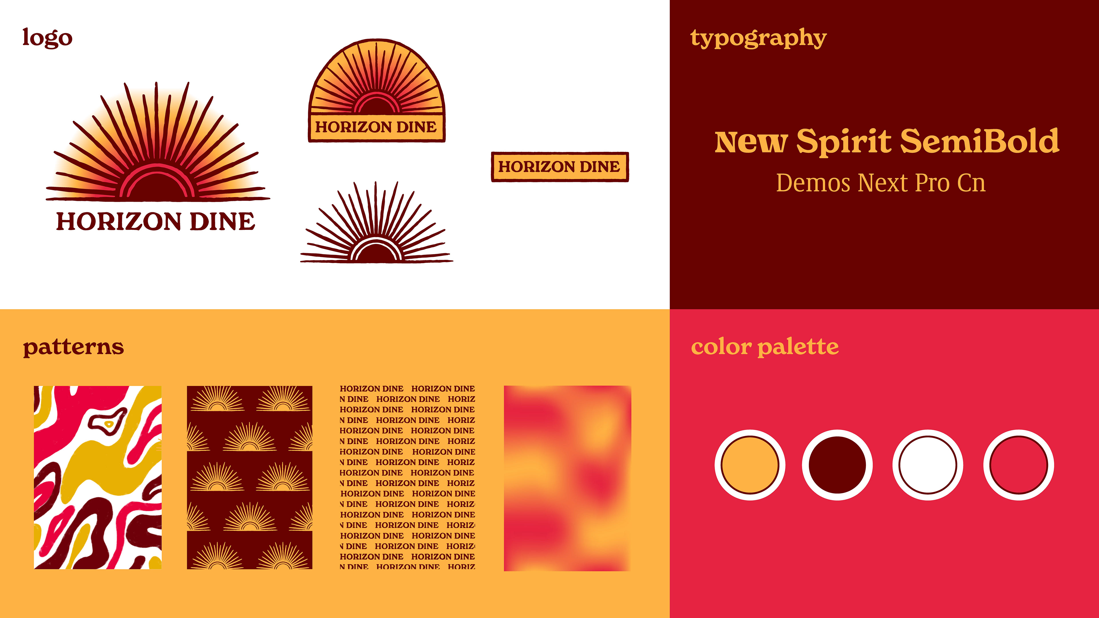
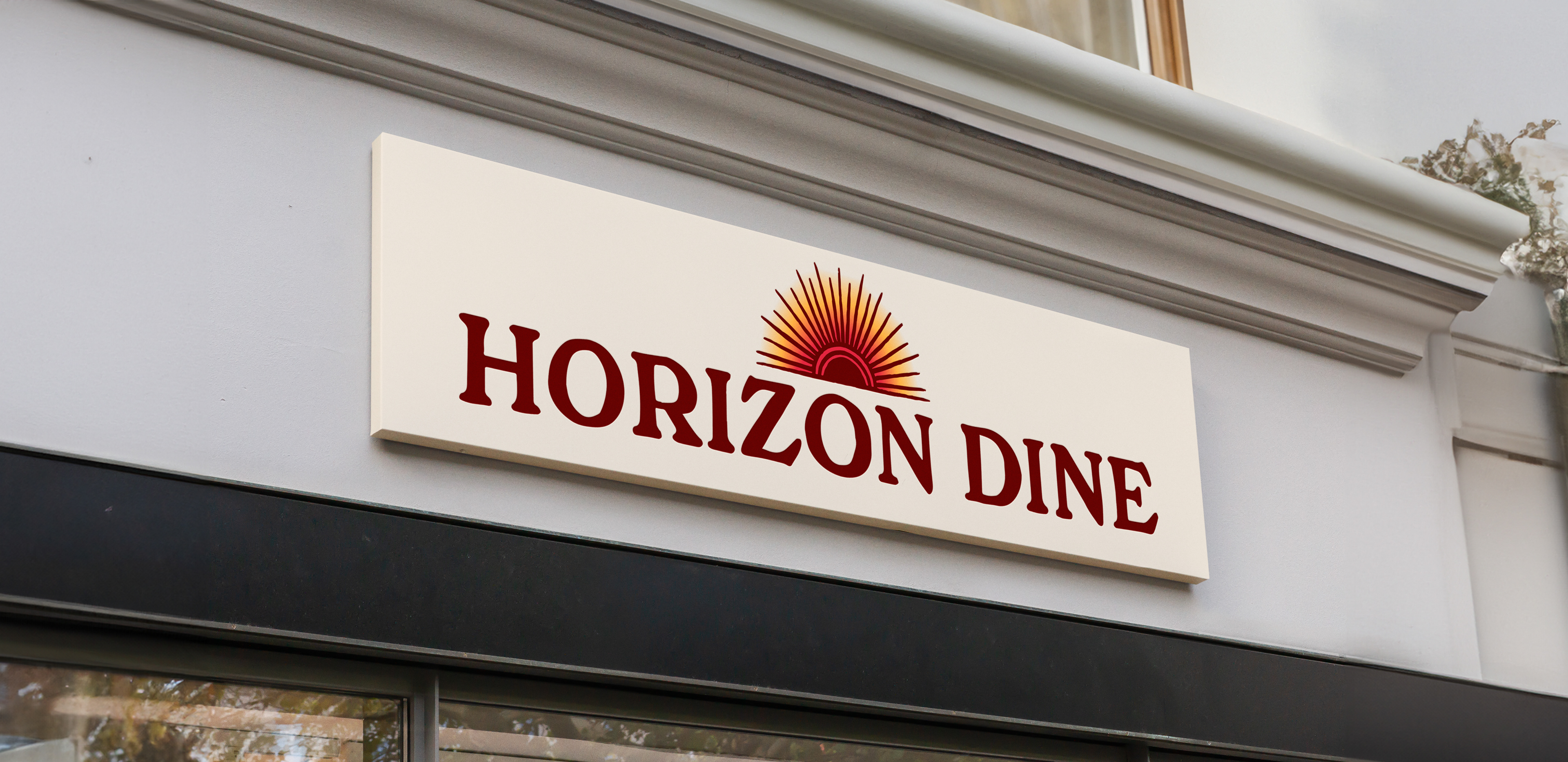
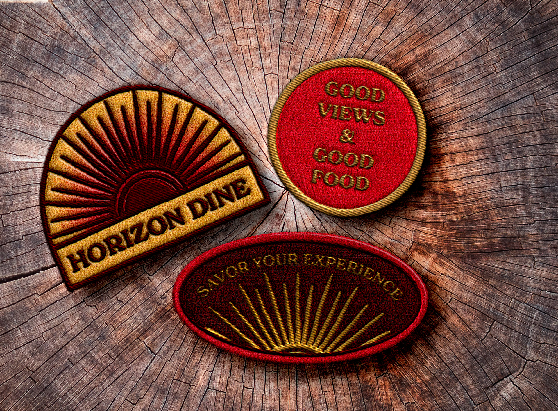
final logo & branding
I wanted the branding to be bright, warm and playful. It needed to have a hint of that retro diner vibe while still feeling modern. The colors are ones that appear in both sunrises and sunsets, to replicate the feeling of basking in the sun. The gradients and abstract shapes are reminiscent of natures beauty.
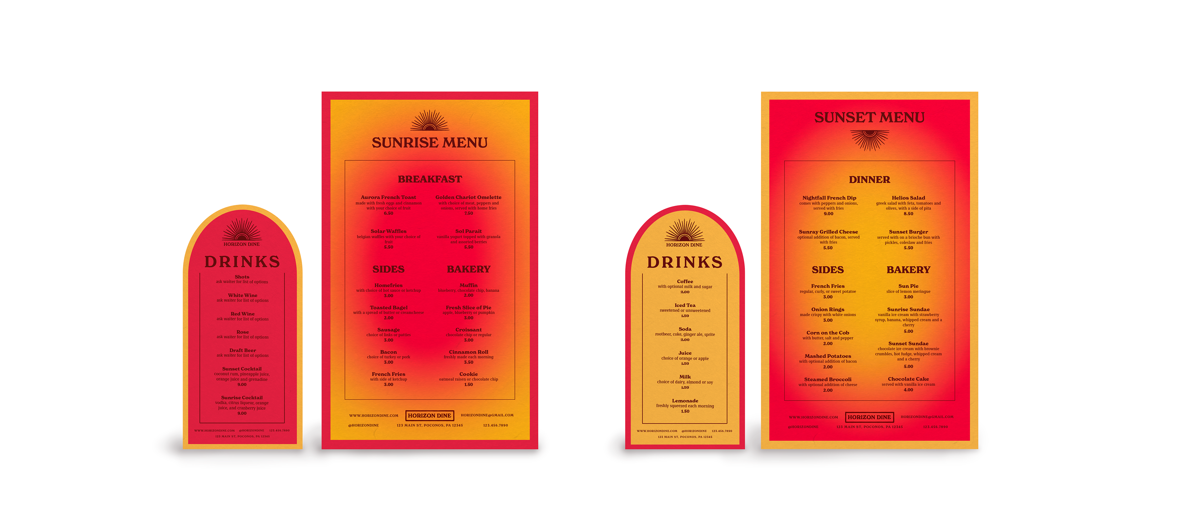
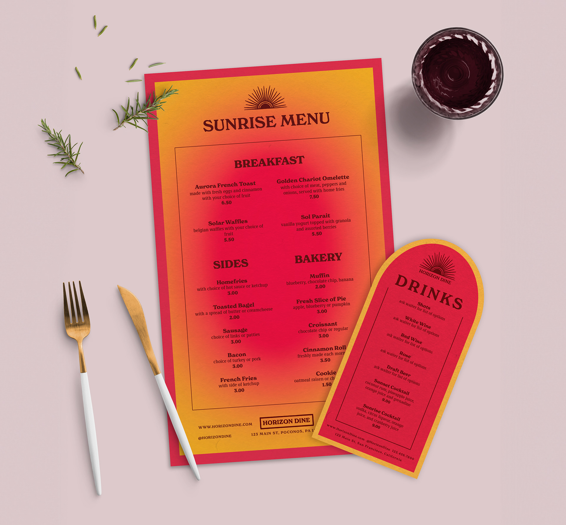
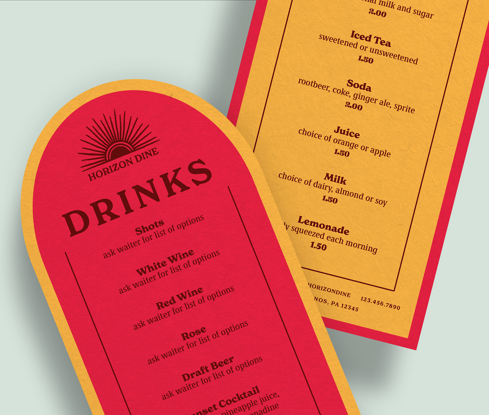
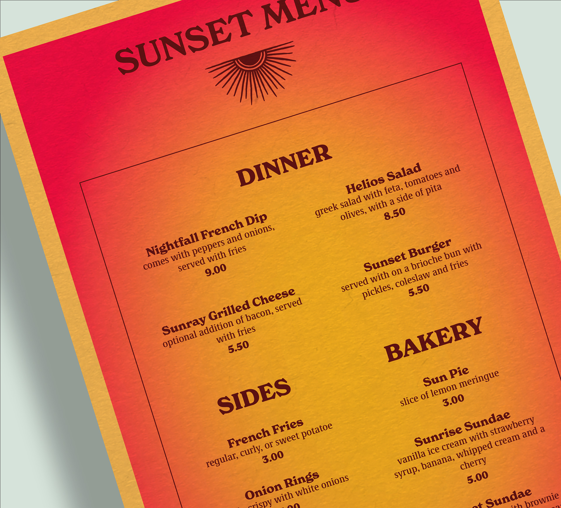
Menus
The menus are double-sided to accommodate for both the sunrise and sunset. The sunrise menu features our breakfast foods while the sunset menu caters more to dinner. Our drinks are located on a separate menu which is also double sided, separating the non-alcoholic and alcoholic beverages. The menus are inverses the of each other in order to more easily differentiate each side. They also feature our main colors and gradients to keep with our branding.
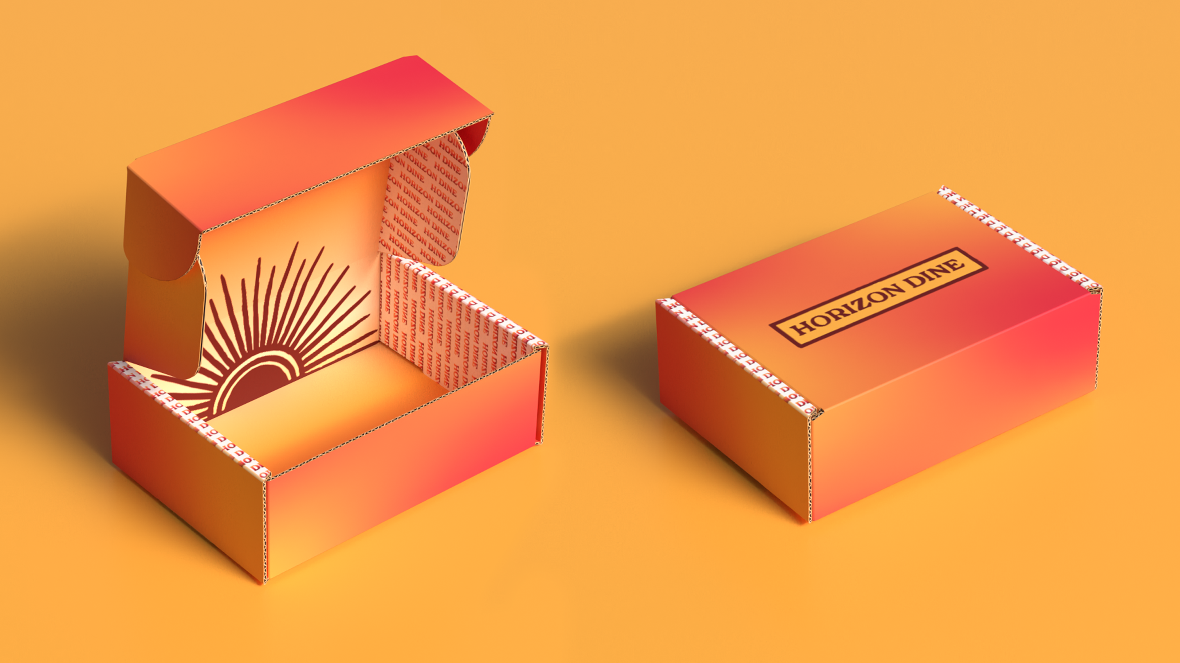
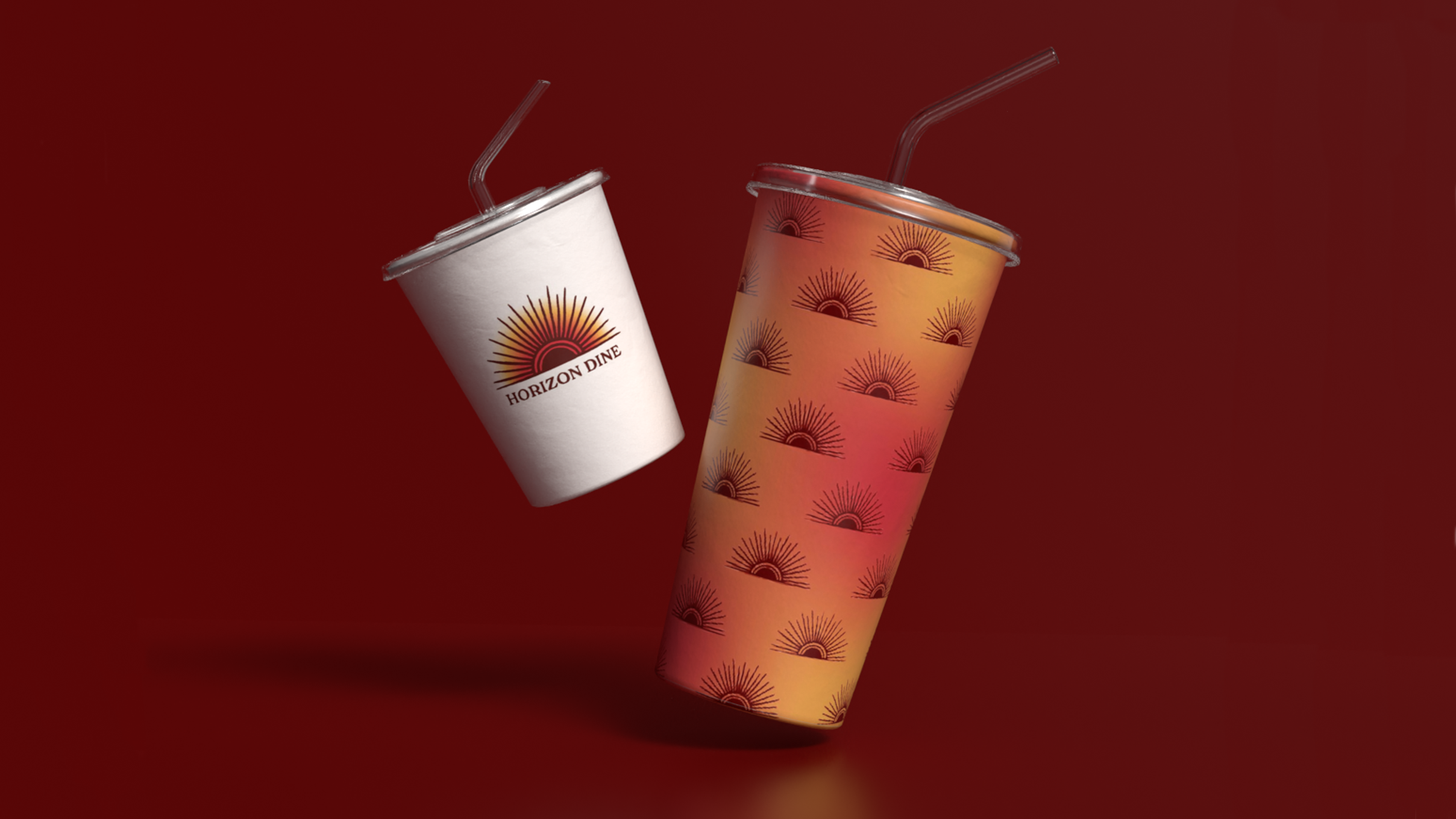
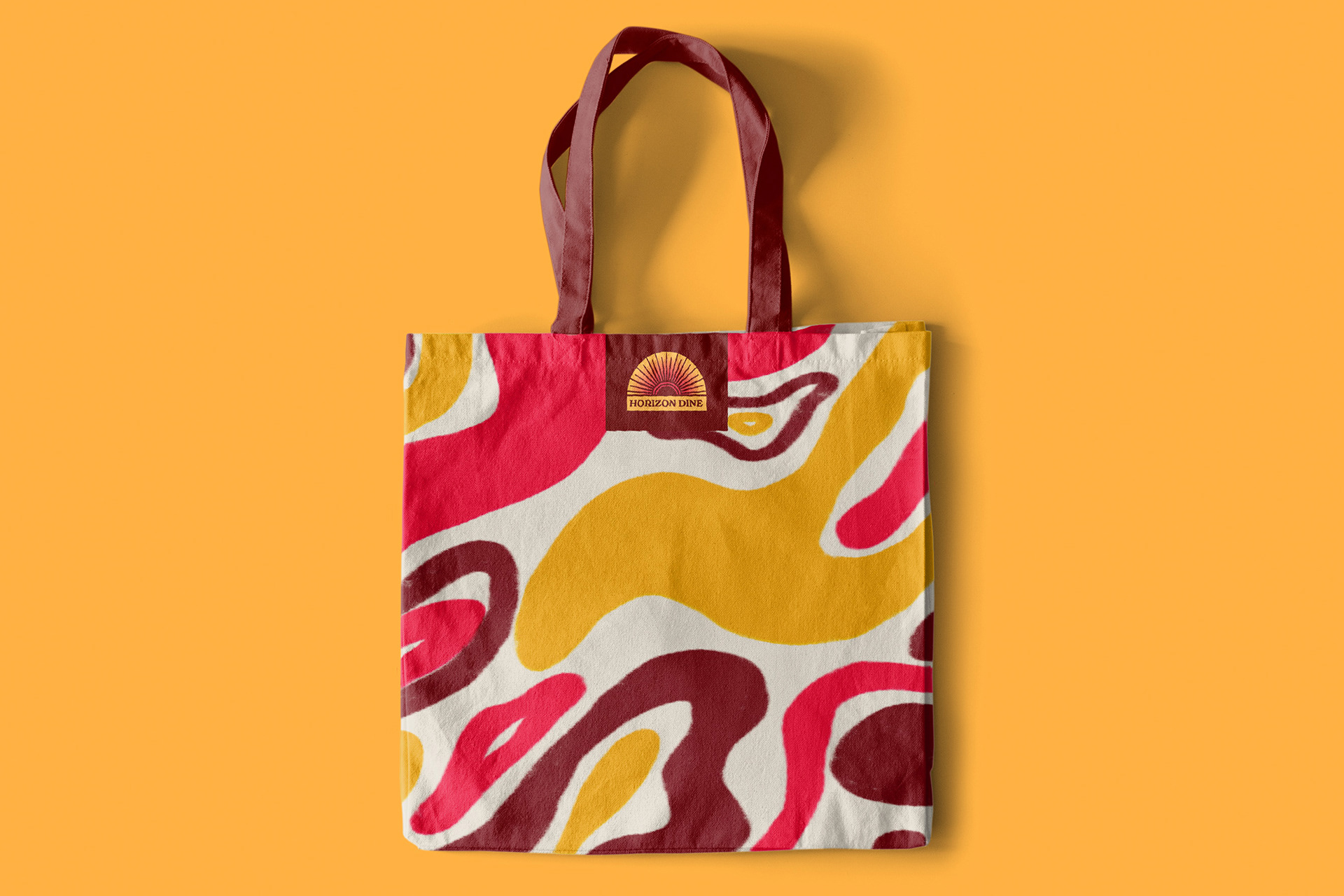
Collateral
For packaging I went with to-go boxes and drink containers. The boxes are meant to replicate the sun on the horizon line. As you open and close the box the sun rises and sets. All elements feature one of the responsive logos and display the brand’s colors. The goal is for someone to be able to see the packaging and immediately recognize it’s Horizon Dine.
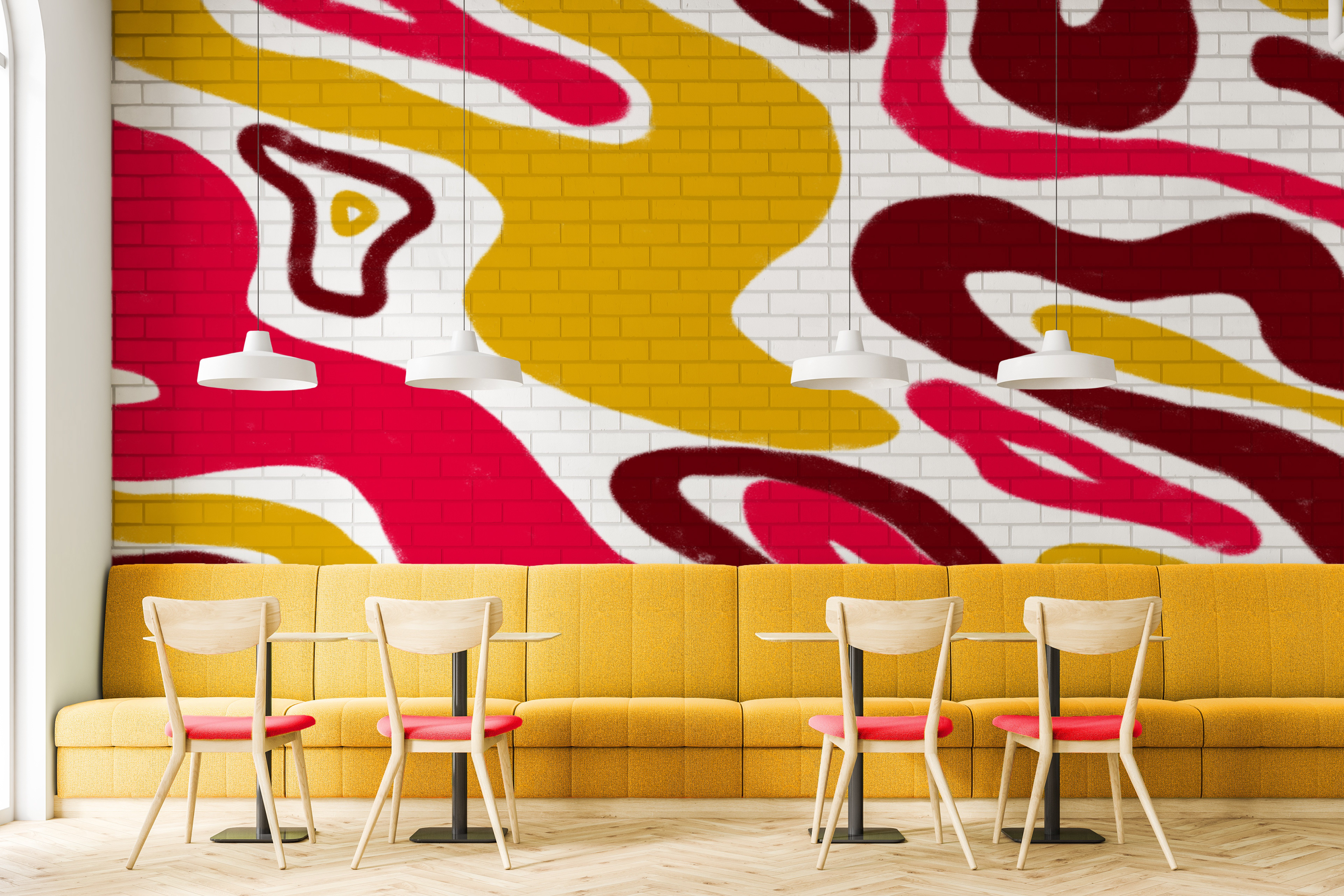
Environmental
The environmental was important to show the atmospheric feel of Horizon Dine. The natural light and vivid colors immerse you in the space.